Here’s Part 1 in the series: How to Paint in Watercolor (part 1)
“I don’t know what to paint if I can’t look at Pinterest or Instagram“
So what do you think people used to do before those things existed?!
I remember my first art lesson when I was eleven years old. The teacher gave us all a big sheet of paper, some children’s poster paints and a thick ugly brush and told us to paint the subject written on the blackboard:
“Bathing the Dog”
I think this was absolutely not the right way to start children off in art. I felt lost and overwhelmed because I’d never owned a dog, or even been up close to one. Much less experienced washing one. I could ramble on now about how that showed up the difference between myself – a working-class kid from a somewhat deprived background finding herself in a middle-class grammar school environment – but this isn’t the place for that. Suffice it to say, that was daunting, perhaps just as daunting as what faces children today when they are told to “find something online and paint your version of it… “ which I am sure is happening in schools around the world.
So I’m on a bit of a mission to encourage you to paint what you see in front of you. Or out of the window. Or in your garden. Or even inside your head. But not on a computer screen.
“What do I start with when I begin to paint?”
First thing if you want to learn to paint is to learn to draw.
Yes, I know you don’t want to learn to draw, you want to learn to paint, but bear with me.
You don’t need to learn to draw well. You don’t need to learn perspective drawing. You don’t need to learn to capture a likeness or even to draw realistically in any way.
What I mean is that you need to learn to pick up a drawing implement of any kind and find a piece of paper of any kind, and transfer some kind of image on to the paper using the implement.

I do believe there is a necessary step here in the process of learning to paint. You could do the drawing bit with a brush and paint if you wanted, but what I’m talking about is the act of putting a representation of something three dimensional down on a surface in two dimensions.
This will force you to look at the thing, which preferably is solid, simple and static, so you can analyse it and make your representation on paper.
So don’t choose your cat unless he is asleep and will remain so for long enough for you to draw him. Don’t choose a complicated landscape because it’s just too ambitious.
Choose an apple, a flower, a pen, a box, a vase, a mug, anything like that and make a quick sketch of it.
Then fill the page with other sketches, and hopefully you will have picked a notebook to draw in so that you can then continue on until it is full!
After making several sketches you can start to learn to paint one of them.
“How do I put paint on paper?”
You could say that painting is a spiritual activity in a way. In order to paint you need to get yourself into the right frame of mind. A mental state that allows you to express the result of something coming into your mind, whether from imagination or from a visual input. We are choosing to express this through the medium of watercolor.
I recommend a short meditation or affirmation, or a prayer, or reading a passage from a favourite book which inspires you, or maybe a walk around your garden or a few minutes contemplating the view … anything other than turning to the computer for inspiration.
Ideally before you do your preparation you will have your painting and drawing tools set up and the space cleared for you to work.
“What do I need to start?”
We all have sets of 24 or 36 or – heaven forbid – 48 or more different colours, but this is the way to easily create an incoherent and disappointing mess.
I suggest a limited palette as being the best way of beginning to paint.
You can create all the colours you need to learn to paint using six basic primary colours which, if properly chosen, will provide you will a large range of secondary and tertiary colours. And those mixes will naturally complement each other.
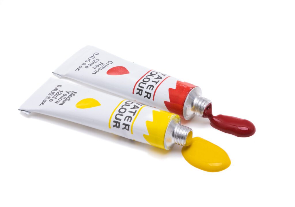
We talked in Part 1 about the choice between tubes and pans, and now I’ll say a few words about the basic colours you need.
Your six basic colours
You need three warm and three cool colours. Red, blue and yellow in each category.
A “warm” colour is a shade that tends toward reddish. A “cool” colour is one that tends away from red. So a warm blue will be a blue with a hint of purplish tones, and a warm yellow will be a yellow with a hint of orange tones. When applied to red we have to look towards a bluish red as a cool red with its hint of purple, and an yellowish red with its hint of orange.
Here are your warm and cool basic colours.
Warm Red – Cadmium Red
Cool Red – Alizarin Crimson
Warm Blue – Ultramarine Blue
Cool Blue – Phthalocyanine Blue
Warm Yellow – Cadmium Yellow
Cool Yellow – Lemon Yellow
All these six colours are found in most good sets of paint and if you look at yours you will probably be able to identify them. There are suitable alternatives to most of them as well, and here are a few of the most common ones:
Warm reds: Scarlet Lake, Pyrrol Scarlet, Naphthol Red
Cool reds: Quinacridone Rose, Magenta, Pyrrol Crimson
Warm blues: Indanthrone Blue, Cobalt Blue
Cool Blues: Winsor Blue, Cerulean Blue, Manganese Blue
Warm Yellows: New Gamboge, Quinacridone Gold, Indian Yellow
Cool Yellows: Hansa Yellow Light, Transparent Yellow, Nickel Azo Yellow
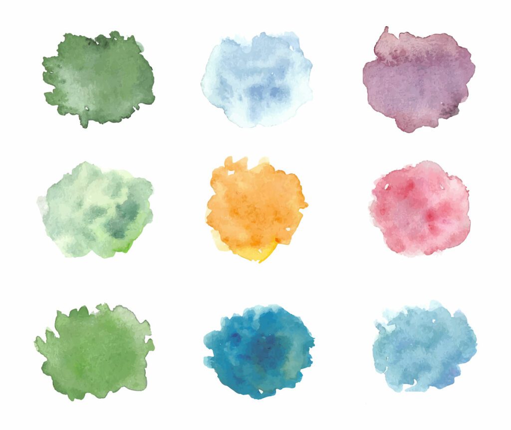
How to mix colours
To make clean mixtures remember warm with warm, and cool with cool as your starting point.
To obtain a good orange, mix either Warm Yellow (cadmium yellow) and Warm Red (Cadmium Red) together, or mix Cool Yellow (Lemon Yellow) with Cool Red (Alizarin Crimson).
For your first test in color mixing, try those two mixes.
Then you can go ahead and try out all the possible combinations.
Once you have done that, and made a chart of the combinations, you can go on to mixing any three sets of colours together in a systematic way, and also chart them.
You will find you obtain a lot of browns and greyish colours in this way, subtle colours that are ideal for nature.
But I don’t want to mix my colours!
Fine, but before you buy lots of premixed colours its worth knowing the principles of colour theory, which is what you will have done if you follow my suggestions.
Then you can select the colours you want, or to simplify things, buy a preselected set of colours to get you started.
Here is my personal preferred palette, which is quite restricted in some ways, but which enables me to paint anything and consists of 24 colours plus white.
Chinese White
Lemon Yellow
Cadmium Yellow
Cadmium Orange
Naples Yellow
Yellow Ochre
Cadmium Red
Permanent Alizarin Crimson
Quinacridone Rose
Potters Pink
WInsor Violet/Dioxazine Violet
Indigo
Raw Sienna
Burnt Sienna
Raw Umber
Burnt Umber
Sepia
Paynes Grey
Indanthrone Blue
Ultramarine Blue
Phthalocyanine Blue
Cobalt Blue
Cerulean Blue
Turquoise
Lamp Black
Suggestions for Preselected Sets
Personally if I am using preselected sets of paints I prefer to use one that contains colours that mix well together and are harmonious.
I have found the Kuretake paints to be the best for this. I also like the large pan size that they come in.
I suggest the Kuretake Gansai Tambi 48 set as a great place to start to learn to paint, and to add to it later the Art Nouveau set which has several very soft colours ideal for florals.
The next thing is to start to paint a subject…
To be continued…
Hi Diane, This is the first time I have left a message since I joined patreon. The “How to Paint Watercolor Part 2” was phenomenal! This info would have taken me 10 or more classes with private clases. Thank-you for your hints, sketches(I haven’t used one yet), and most of all such marvelous classes on youtube and the Blog. You are the best.
Sorry for the tardy reply Terri, I’m still catching up after being sick with Covid and then the hurricane – I’m so glad you enjoyed the article on how to paint watercolor. It’s very encouraging for me to continue to produce things like that when people let me know it’s been helpful. Best wishes Diane xxx
I love Blogs like this. Slowing down and talking out the exact steps and WHY we do it that way. I always understand things better when I have the Why of what we’re doing. I’d like to see one about the differences between some of the colors or what exactly is a cadmium color as opposed to the quinacridone colors. Also maybe some mixing tips if you’re using a color that has made from more than one pigment. maybe something in depth on different brushes, what they’ used for and special brushes. I saw a video where the guy was saying that petal brushes make flowers so much easier but it looked like a cats tongue to me. I found a set of petal brushes but again they look to me to be cats tongue. Lastly a tri-wedge brush?? Supposed to be able to double and even triple load this typed? How do you do that? Can it be done with any brush? Anyway I love your blogs and am proud to be a patreon member! Would love to see you do a LIVE Q@A so we can throw questions at you and watch you you paint examplles on the spot.
Hi Debra and sorry for the tardy reply to your message, still catching up after having been sick with Covid and then the hurricane that hit us at the start of November … Yes, there are so many questions and so many answers. Lots to learn. About the Cadmium versus Quinacridone – genuine cadmium is toxic and is no longer used in paint manufacture. The substitutes they use are safe and somewhat different in character. Cadmium colours always were traditionally somewhat opaque, rather than transparent. Quinacridone colors are very transparent and intense, and I prefer them really as they are a brighter way to paint. And yes, we will do a live as soon as our internet gets fast enough to be reliable – hopefully early next year we’ll be getting fibre optic service which should help!
I wonder, how you mix the blue `cloud`in the middle of the first row. Is it with a lot of water?