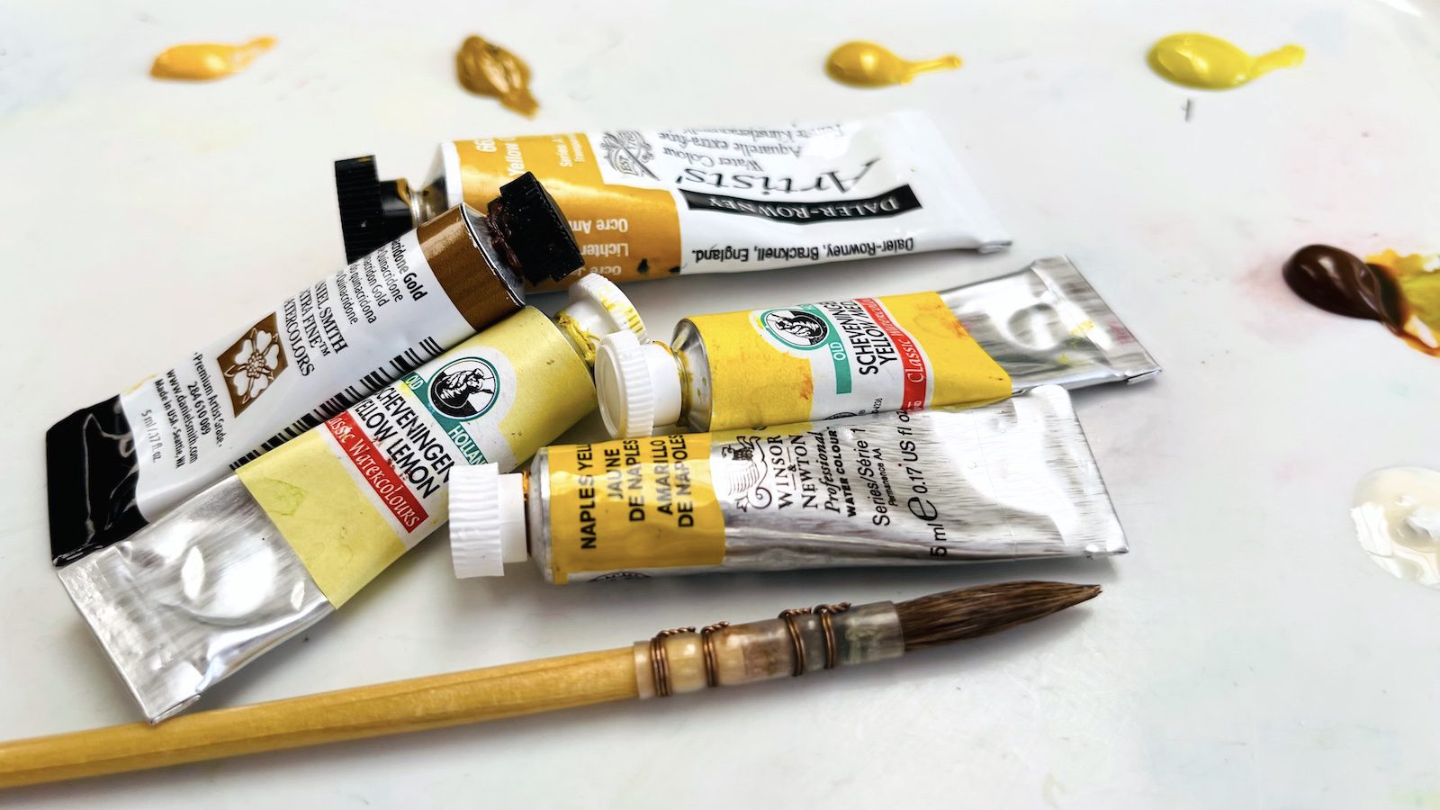
Materials for Videos: To search this mostly unorganised list do Command F and you will get a search box and you can type in what you are looking for.
Hoping to have time to organise this soon! Meanwhile, it‘s better than nothing, isn‘t it!
If you prefer to search directly within our Amazon shop you can click here: www.amazon.com/shop/dianeantonestudio
Paints
Winsor & Newton Cotman 20 Tube Set https://amzn.to/3No8Y7P
Paul Rubens Artist Watercolor Paint 36 Set https://amzn.to/3HhIHWF
Kuretake Gansai Tambi set of 36 colors https://amzn.to/3KXuWxB
Kuretake Gansai Tambi Art Nouveau set https://amzn.to/3KkQxRl
Kuretake Gainsai Tambi 48 Color Set https://amzn.to/3zZX8Kn
Kuretake Starry Colors https://amzn.to/3J4eXMz
Kuretake Graphite Colors https://amzn.to/3SdzEd3
Jean Haines All That Shimmers set https://amzn.to/3Owx5jn
Viviva Colors https://tinyurl.com/vivivacolors
Daniel Smith 12 color pan set https://amzn.to/3pll8GQ
QoR Introductory Set of watercolors https://amzn.to/3tqazRF
A Gallo Handmade Watercolors Signature 1 Set of 12 https://tinyurl.com/gallosignature1set
A Gallo Handmade Watercolors Signature 1 and 2 Set of 24 https://tinyurl.com/gallosignature1and2set
A Gallo Handmade Watercolors Classic 24 Set https://tinyurl.com/galloclassic24set
A Gallo Handmade Watercolors Collection 48 Set https://tinyurl.com/gallocollection48set
Winsor and Newton Watercolors
Quinacridone gold https://tinyurl.com/2b53nta5
Alizarin Crimson https://tinyurl.com/2mfwv76u
Cobalt Blue https://tinyurl.com/hrbmjtt8
Olive Green https://tinyurl.com/pskenpvk
Burnt Sienna https://tinyurl.com/yjptnnct
Winsor Violet https://tinyurl.com/d28dpu5h
Ivory Black https://tinyurl.com/fxsm9ffy
Cadmium Orange https://tinyurl.com/csfb75dn5
Olive Green https://tinyurl.com/pskenpvk
Potters Pink https://tinyurl.com/2kn5kfes
Burnt Sienna https://tinyurl.com/yjptnnct
Sepia https://tinyurl.com/9ssyn98
Quinacridone purple https://tinyurl.com/vu4hdefw
Winsor Violet https://tinyurl.com/d28dpu5h
Permanent Rose https://tinyurl.com/bnkz7xmk
Quinacridone gold https://tinyurl.com/2b53nta5
Turquoise https://tinyurl.com/yfejj9zf
Alizarin Crimson https://tinyurl.com/2mfwv76u
Cobalt Blue https://tinyurl.com/hrbmjtt8
Viviva Colorsheets Set https://amzn.to/3fpfjQt
Watercolour Paper
Etchr 140lb cold pressed A4 size watercolor paper block https://amzn.to/3eoLp1f
Canson XL Mixed Media Sketchbook 5.5×8.5” 90lb / 160gsm https://amzn.to/41gIXgZ
Canson XL Mixed Media Sketchbook 8.5×11” 90lb / 160gsm https://amzn.to/3YRg35F
Canson XL Mixed Media Sketchbook A4 140lb / 300gsm https://amzn.to/3M6OcLa
Canson XL Mixed Media Sketchbook A5 140lb / 300gsm https://amzn.to/3nCAB3Z
Clairefontaine Fontaine 140lb 100% cotton Cold Pressed paper https://amzn.to/3xveD5d
Fabriano Tiziano 40% cotton pastel paper in 6 soft colors https://amzn.to/3QQH6tS
Bockingford 9 x 12 Cold Press https://amzn.to/3Cgb85H
Bockingford 10 x 14” Cold Pressed block https://amzn.to/3BBLCGe
Arches paper https://amzn.to/3JYOu3p
Clairefontaine Etival paper https://amzn.to/3DacXzg
Hahnemuhle block https://amzn.to/43SQlAd
General Kit (pens, pencils, paper etc)
Signo Gold Gel Pens: https://amzn.to/3NAqXJC
Winsor and Newton fineliner https://amzn.to/3MFkGL9
Faber Castell Pitt Pastel Pencils https://amzn.to/3oG70aA
Kneaded eraser Faber Castellated https://amzn.to/3PeLFQm
Gelli Arts Gel Printing Plates various sizes https://amzn.to/4269PQb
Strathmore Tracing Paper Pad 9×12” https://amzn.to/3MxjMRU
Staedtler Mars Lumograph set of 6 assorted pencils https://amzn.to/3MJfibh
Pentel White Hybrid Gel Grip DX Gel pen https://amzn.to/435GarU
Brush holder https://amzn.to/3ZxLjGp
Coliro Gold Paint https://amzn.to/3z732JF
Poetique Brush Pens https://amzn.to/3nnhHxW
Posca PC-1M White 0.7mm https://amzn.to/3JMsBVB
Canon Printer https://amzn.to/3LBi7ee
Derwent Graphic Drawing Pencils 6B to 4H https://amzn.to/40iLS7I
Sax 80lb Sulphite paper https://amzn.to/3INkcAE
Sheet Protectors for 3 ring binders https://amzn.to/3UXXc7J
3 Ring Binder 1.5” with customisable cover https://amzn.to/3VbBKwh
Stabilo Carbothello pastel pencil https://amzn.to/3Ja2HvB
ETCHR Pearlescent Watercolor Set of 12 https://amzn.to/3lStLq3
Winsor & Newton Fineliner Fine Point Pens – Sepia https://amzn.to/3S9zRhY
Princeton Aqua Elite Synthetic Kolinsky Brush, Round, size 12 https://amzn.to/3RqtTcb
Pentel White Hybrid Gel Grip DX Gel pen https://amzn.to/435GarU
Uniball Signo Gel Pens https://amzn.to/3NPTqJd
Winsor & Newton Fineliner Fine Point Pens – Black https://amzn.to/3Ywuiwp
Winsor & Newton Fineliner Fine Point Pens – Sepia https://amzn.to/3S9zRhY
Pro Arte Sword Liner small (Jacksons) https://tinyurl.com/yckwfmky
Princeton Aqua Elite Synthetic Kolinsky Brush, Round, 8 https://amzn.to/42P6whE
Strathmore greetings cards https://amzn.to/3vIh7vs
Etchr greetings cards https://etchrlab.com/collections/cards/products/gccp
Finetec Coliro Gold and Silver Watercolor Paints https://amzn.to/3w5uarf
Tombow Fudenosuke Brush Pens https://amzn.to/3QIcn2N
Ron Ranson Pro Arte Hake Brush https://amzn.to/3eIvICj
Dr PH MArtin’s Bleedproof White https://amzn.to/3GGIa0R
ZenArt Black Tulip Brush Set. https://amzn.to/3CxV9OG
Uniball Signo Gel Pen Set of 10 Assorted Colors https://amzn.to/3SBegxA
Staedtler Karat Aquarell pencil https://amzn.to/2Ym4Q33
Staedtler Fineliner pen set: https://amzn.to/3Tw
Meeden Ceramic Palette: https://amzn.to/3P1QQ3o
Litenergy Lightbox https://amzn.to/3nTBj9R
Ptolemy Dean, Britains Buildings, Places and Spaces: https://amzn.to/3AOhnNv
Etchr Hot Press Watercolor Block A4 https://amzn.to/3JimxmP
Hahnemuhle Bamboo mixed media pad https://amzn.to/3JAlgry
Fabriano Artistico paper https://amzn.to/3ueqBOO
Derwent Inktense watercolor pencils https://amzn.to/3yucSGe
Royal & Langnickel Gouache 24 set https://amzn.to/3MRK9Pk
Uniball Signo Gel Pens https://amzn.to/3NPTqJd
Sakura Pigma Micron Fineliners https://amzn.to/3NMEg7s
Square Viviva Sketchboook: https://tinyurl.com/squareviviva
Starter Sheet Set plus brush: https://tinyurl.com/StarterSetplus
White gouache: https://tinyurl.com/4pyt2cjh
Baohong paper block 8 x 6 inches https://amzn.to/3J8D8YP
Stabilo felt pen brown https://amzn.to/3r0PhJb
Silky Bookmark Tassels https://amzn.to/3JkvfzH
Isabey Squirrel Mop Brush size 6: https://amzn.to/3x0ffAf:
ZenArt Rigger:https://amzn.to/37bGOeX
Faber Castell Albrecht Durer colored pencils https://amzn.to/3aa0fTF
Staedtler Karat Aquarell pencil https://amzn.to/2Ym4Q33
Staedtler Karat Aquarel watercolor pencil https://amzn.to/2Ym4Q33
Uniball Signo broad white pen https://amzn.to/3QcfUph
Glass Pen https://amzn.to/3DQOgbh
Black Tulip direct link for brushes https://tinyurl.com/57j6f2n6
Etival paper https://amzn.to/3DacXzg
Washi Tape https://amzn.to/3kVOdCd
Staedtler Mars Eraser https://amzn.to/2XtVkde
STAEDTLER MARS LUMOGRAPH 4B PENCILS https://amzn.to/3CNrUXv
Kuretake water brush https://amzn.to/3fmsVfo
Pentel Waterbrush https://tinyurl.com/2shxw7ts
Viviva Colorsheets Set https://amzn.to/3fpfjQt
Black Tulip direct link for brushes https://tinyurl.com/57j6f2n6
Staedtler Mars Eraser https://amzn.to/2XtVkde
STAEDTLER MARS LUMOGRAPH 4B PENCILS https://amzn.to/3CNrUXv
Kuretake water brush https://amzn.to/3fmsVfo
Pentel Waterbrush https://tinyurl.com/2shxw7ts
Black Tulip direct link for brushes https://tinyurl.com/57j6f2n6
St Petersburg White Night https://amzn.to/3zde3b1
Glass Pen Set https://amzn.to/3sMJaYq
Glass Pen https://amzn.to/3mOLJIL
Dr. Ph. Martin’s Bombay India Ink https://amzn.to/3mPZGFY
PANDAFLY Professional Charcoal Pencils https://amzn.to/3gI2WQ9
Glass Pen Set https://amzn.to/3sMJaYq
Glass Pen https://amzn.to/3mOLJIL
Black Tulip Set https://amzn.to/3goIun0
Kuretaki water brush https://amzn.to/3fmsVfo
Pentel Waterbrush https://tinyurl.com/2shxw7ts
Sennelier Set of Four Inks https://amzn.to/2WsZPo3
Dr. Ph. Martin’s Bombay India Ink https://amzn.to/3mPZGFY
Vine Charcoal in various grades: https://amzn.to/3Bl9UlI
Molotow Masking Pen https://amzn.to/3kxw39F