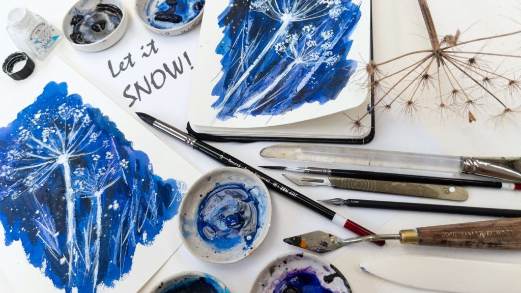
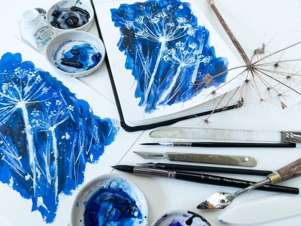
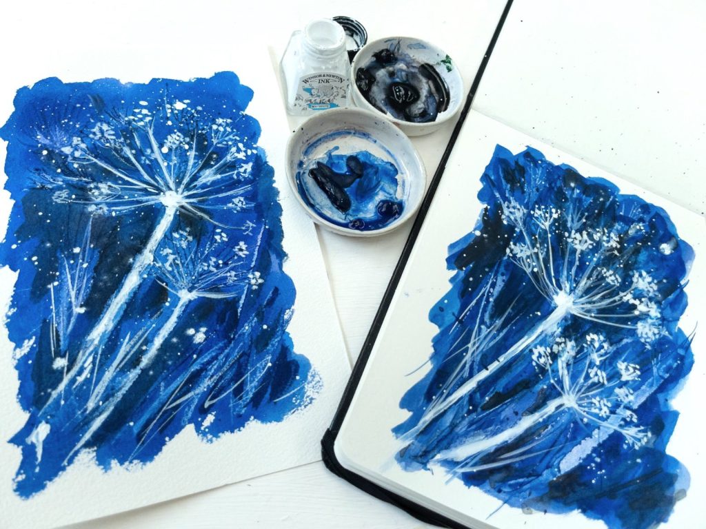
In this video I am comparing a piece of Arches and Viviva 140lb watercolor paper. Using a demanding technique of thick, intense paint and heavy scratching out I wanted to put the paper through its paces. I decided to do a quick little wintry sketch today using one color and several tools, so I settled on this little scene showing dry stalks of hogweed against a snowy background. Acknowledgement to Ann Blockley’s book Flower Painting through the Seasons for the idea.

I decided to compare two types of paper and to do the painting twice as near as possible identically to each other.
My Viviva sketchbook is only A5 size, so I cut a piece of A4 Arches 140lb in half to match. Visually there are several differences between these papers – the Arches is creamier in color, has more tooth, is slightly thicker and stiffer. I was curious to find out whether this intensive scratching out technique would work better on one rather than the other, or be both the same!
Comparing Arches and Viviva Watercolor Paper
I used four shades of blue for this painting – pthalo blue, cobalt blue, ultramarine and winsor violet. These are all available in a basic box of paints like these ones:
Winsor and Newton Cotman is ideal for students as it is good and reliable and still not very expensive.
Paul Rubens is relatively new to the market and popular while remaining very inexpensive. A good starter box.
This student grade tin by Sennelier is a great buy. The quality is excellent and the selection of colours good.
I used various implements to do the scratching out, including the end of a paint-brush, a scalpel, a credit card, a glass pen, a palette knife and a bone folder.

What did I find?
The final painting on each paper was satisfactory, I thought. The tooth of the Arches is much more noticeable than on the Viviva, The paint seemed to sink into the paper more, the Viviva having something of the character of hot-pressed paper in that it allows the paint to stay on the surface more than the Arches paper does. The scratching out was easier on the Arches paper as there is more texture again to scratch into. But when it came to applying the white ink it was a little easier on the Viviva for the same reason – it stays on the surface and doesn’t sink in as much, so keeps its brightness more.
