As the days grow shorter and the air becomes crisp, fall brings a stunning array of colors that inspire artists to capture the beauty of the changing season. From the rich, warm hues of fallen leaves to the soft, muted tones of misty mornings, the colors of autumn offer endless possibilities for your watercolor palette.
In this post, we’ll guide you through selecting a limited fall-inspired palette and share tips on mixing vibrant and earthy tones that will evoke the essence of the season. Whether you’re using Daniel Smith, Winsor & Newton, Schminke, Michael Harding, or another brand, you’ll be ready to paint autumn landscapes, cozy scenes, and everything in between.
Why a Limited Palette?
Using a limited palette of just six colors can seem restrictive at first, but it offers many benefits. By narrowing your choices, you create harmony and cohesion in your work, allowing the colors to interact and blend in interesting ways. A smaller palette also challenges your creativity, encouraging you to mix and explore a wider range of tones from just a few starting points.
For fall, a well-balanced palette can reflect the season’s warmth and earthiness, while still offering flexibility to capture a variety of scenes and moods.
Selecting Your Fall Palette: 6 Core Colors
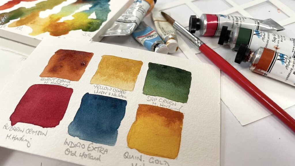
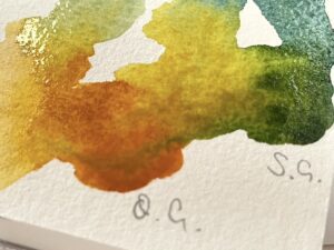
Choosing just six colors can be a fun exercise in building your perfect fall collection. Here are six foundational hues to consider, along with their characteristics and versatility:
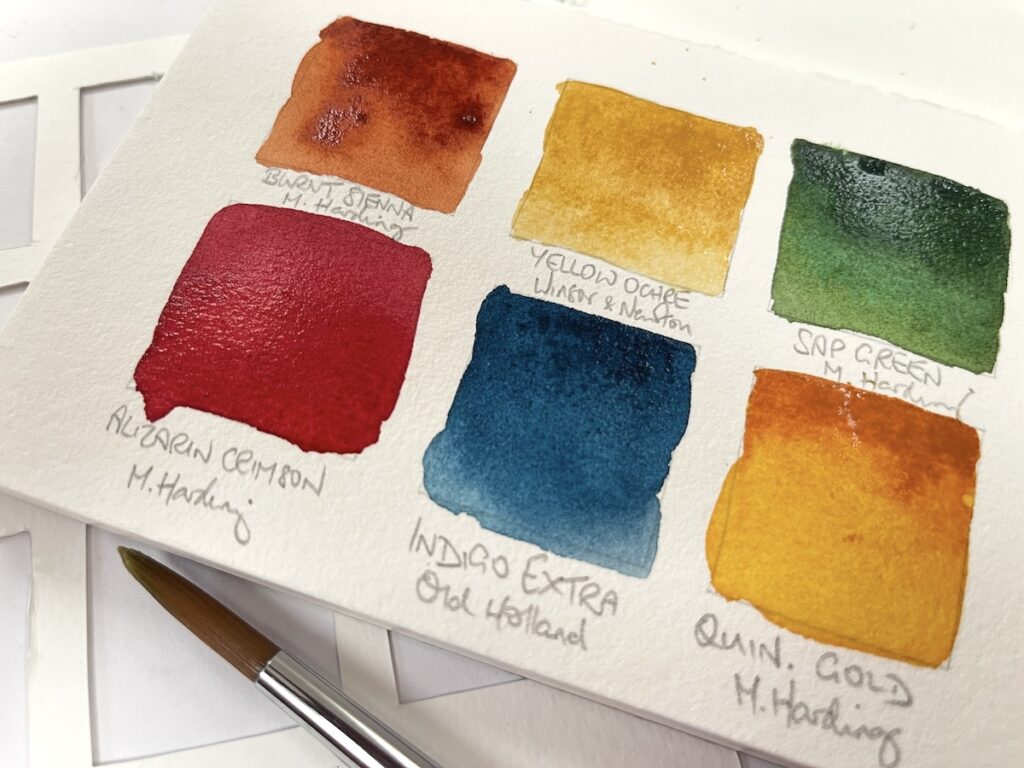
- Burnt Sienna
A classic fall color, burnt sienna provides warmth and richness, perfect for tree trunks, foliage, and shadows. It’s a versatile earth tone that mixes well with other colors to deepen shades. - Yellow Ochre
This warm, muted yellow is essential for capturing golden leaves, fields of grass, and autumn skies. It also makes a great base for mixing greens and browns. - Deep Red (Perylene Maroon or Alizarin Crimson)
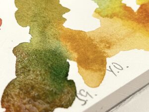
A deep, moody red will bring drama and intensity to your palette. Perfect for autumn leaves and berries, this red can be mixed with burnt sienna for rich, earthy browns. - Sap Green
While fall is known for its reds and oranges, don’t forget about the greens still present in the landscape. Sap green is an earthy, muted green that pairs beautifully with ochres and siennas to create natural, subdued foliage. - Indigo
A deep blue like indigo is great for adding depth and contrast to your autumn palette. Use it to create cool shadows or mix it with reds and yellows for stormy skies and dusky tones. - Quinacridone Gold or Raw Umber
For a final touch of fall warmth, Quinacridone Gold provides glowing, transparent yellows perfect for late afternoon light, while Raw Umber gives you a strong, earthy brown for rich tree bark and soil tones.
These six colors, while simple, offer a broad range of mixing possibilities, allowing you to capture the essence of fall with ease.
Mixing Techniques for Perfect Fall Shades
Once you’ve selected your core colors, the next step is to experiment with mixing to create those iconic fall hues. Here are some simple mixes to get you started:
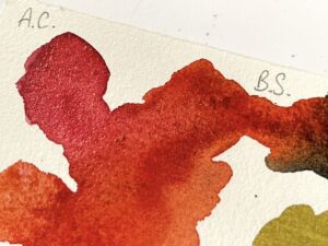

- Rusty Reds and Browns: Combine deep red (Perylene Maroon) with burnt sienna to create a range of rusty, earthy reds. Adding a touch of yellow ochre will give you a more muted brown for tree bark or earthy backgrounds.
- Muted Greens: For an aged, faded green that captures the last of the summer foliage, mix sap green with yellow ochre or a touch of burnt sienna. You’ll get a lovely muted tone that’s ideal for softer landscapes.
- Warm Shadows: Mix burnt sienna with indigo to create rich, deep shadows that have just the right amount of warmth. Perfect for painting fall twilight scenes or the shadowy undergrowth of forests.
- Golden Hues: For a glowing golden yellow, combine quinacridone gold with a touch of yellow ochre. This mix is perfect for capturing the light filtering through autumn leaves.
As you experiment, keep in mind that fall colors are often muted and layered. Don’t be afraid to build up colors slowly with washes, allowing the pigments to blend softly.
Exploring the Different Paint Brands
Whether you’re a fan of Daniel Smith’s wide pigment range, the smooth flow of Winsor & Newton, the buttery texture of Sennelier, or the rich offerings of Michael Harding, each brand offers unique qualities that can enhance your fall palette.
- Daniel Smith: Known for its vast range of pigments, Daniel Smith offers vibrant yet natural tones perfect for fall. Their Quinacridone Gold and Burnt Sienna are favorites for autumnal landscapes.
- Winsor & Newton: With excellent consistency and mixing properties, Winsor & Newton’s Alizarin Crimson and Yellow Ochre are popular choices for fall palettes.
- Schminke: Schminke’s watercolors offer excellent transparency, making them perfect for creating layered fall washes, especially with their Perylene Maroon and Raw Umber.
- Sennelier: For those who prefer a more buttery texture, Sennelier’s Sap Green and Burnt Umber are excellent for building deep, rich autumnal tones.
- Michael Harding: Renowned for their high pigment load and intensity, Michael Harding watercolors are a fantastic choice for artists seeking vibrant, bold fall colors. Their Yellow Ochre and Burnt Sienna are particularly great for capturing the warmth and richness of the season.
Each brand has its own texture, granulation, and flow, so choosing your favorite comes down to personal preference and the effect you want to create.
Conclusion: Embrace the Season in Your Artwork
Fall is one of the most inspiring seasons for artists, offering a rich array of colors and moods to capture. By working with a limited palette of just six core colors, you’ll have the opportunity to explore the subtleties of autumn tones and create cohesive, beautiful artwork.

So grab your paints, experiment with mixing, and embrace the spirit of fall in your next masterpiece. With your carefully chosen palette and a few key blending techniques, you’re ready to bring the warmth and beauty of the season to life!
This guide offers a foundation, but feel free to personalize your palette with your favorite colors and brands. What fall colors inspire you the most? Let us know in the comments below!
ps. Links to Amazon in this post are affiliate links.
Thank you, Diane. Such a wealth of information! I am on overload in a beautiful way!
Thank you! This was so interesting and helpful.
What beautiful fall colour options. Thank you for sharing this helpful information.